Y1U1W1
Methods of Iterating
To start identify a tool or medium that interests you but that you’re not experienced with.
Then: Find a project made by someone else that makes effective use of this tool or medium.
Remake this selected project as best as you can, with as much fidelty as possible. (Through this task you’ll be primarily engaged in iteration according the first definition shown to the right.)
Provisional Definitions
iteration’
refining to get a singular desired output
Tool: Gephi
For my iteration project, I chose a data visualisation program. When conducting design research, it is always essential to collect and analyse data. I selected this programme with the expectation that I would be able to experiment with ways of communicating data effectively in future research. Of course, I also found the data visualisation work visually interesting.
Gephi can change the design of a network in real time. This is very intriguing as it allows me to see how each piece of data behaves.
Before I started, I looked at some examples and read up on where it’s used, and found that it’s mainly used for social network analysis.

Project
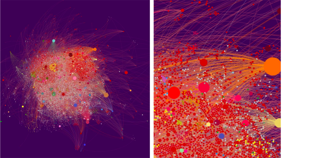
While searching for artists using the programme, I came across an artist called Yunhan Huang. She uses a variety of data, such as comments on internet broadcasts, to compose her artwork. In particular, I found her ‘Planet Series’ projects, which use huge amounts of data to create graphics such as planets.
I decided to copy it after seeing an interesting node configuration.
Process
Datasets
Since I had never used Data Visualisation programme before, I started with basic tutorials to become familiar with the software.
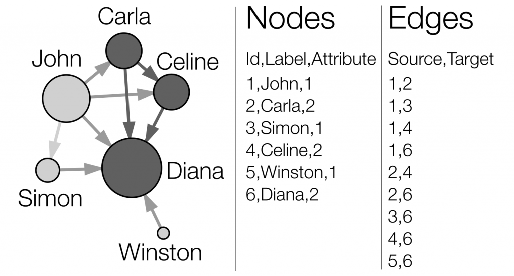
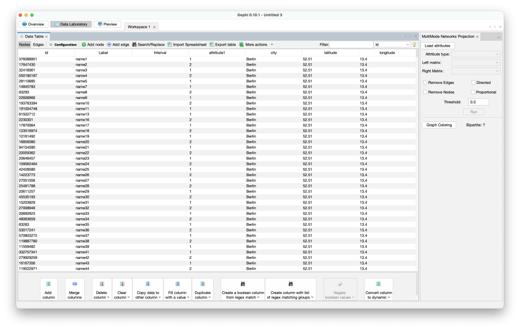
I went through the GEPHI – Introduction to Network Analysis and Visualization (Tutorial) on YouTube. Starting from scratch, learning how it works and figuring out what datasets I needed. I found how to format the links between nodes. Each piece of data could be hierarchically organised and categorised.
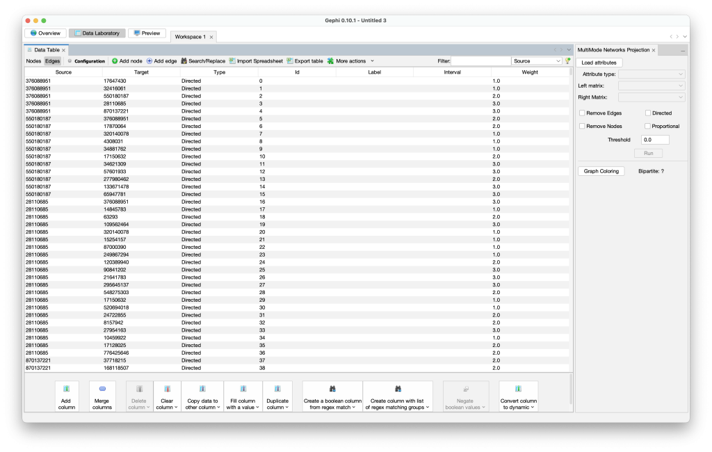
Iteration
Spatialisation
I was particularly impressed by the spatialisation process. This visualization disposes nodes in a gravitational way. I’m able to distinguish communities more densely connected parts of the network.
Through visualising, I represented the directionality and weight between the data in the Excel file. Directionality between data was represented by arrows on the connecting lines, and weights were represented by a structure where the size of a node increases with the number of other nodes connected to it.
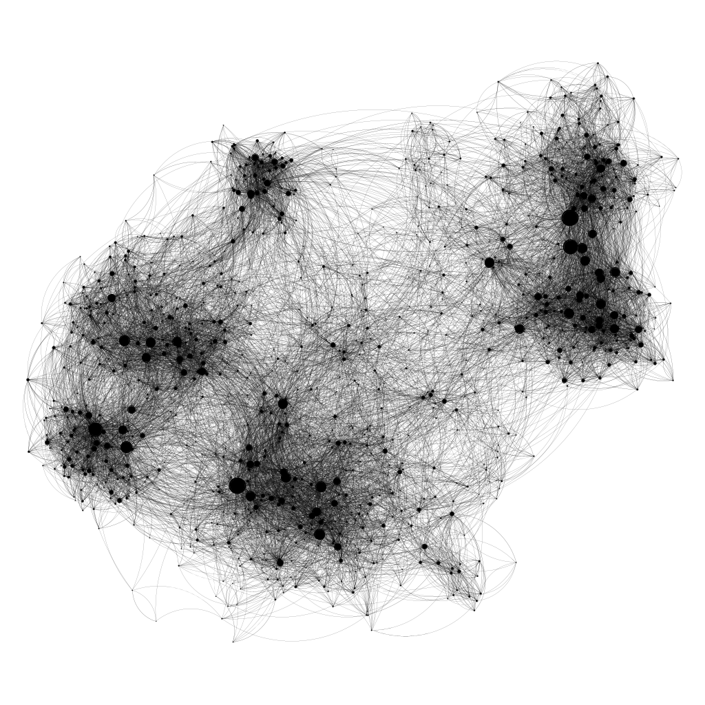
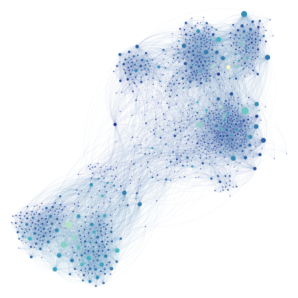
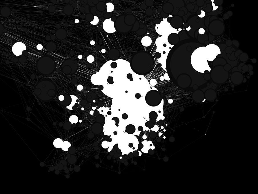
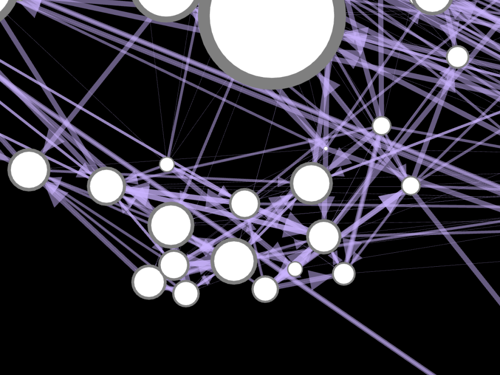
I then moved the position of each node by hand and changed the colour one by one to mimic the project I had chosen, as I did not have the same data file as the project. In the process, the hierarchy of the data broke down and the purpose of ‘data communication’ was lost, i.e. the message of one side was transformed for aesthetic correction.
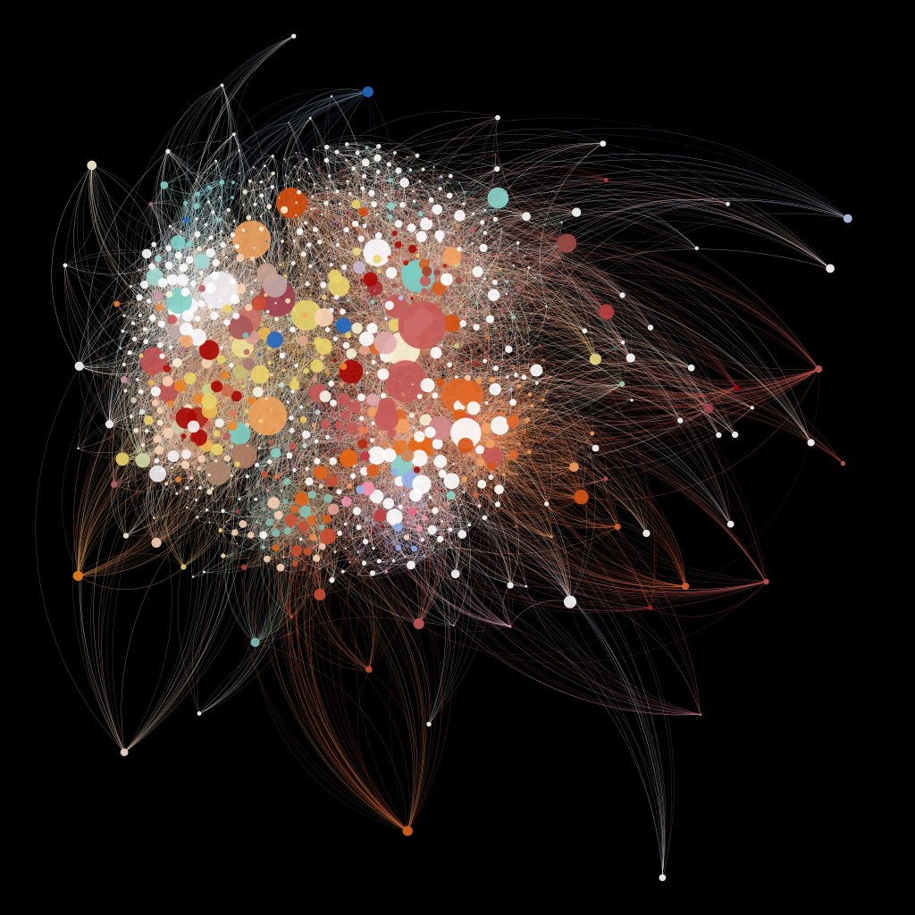
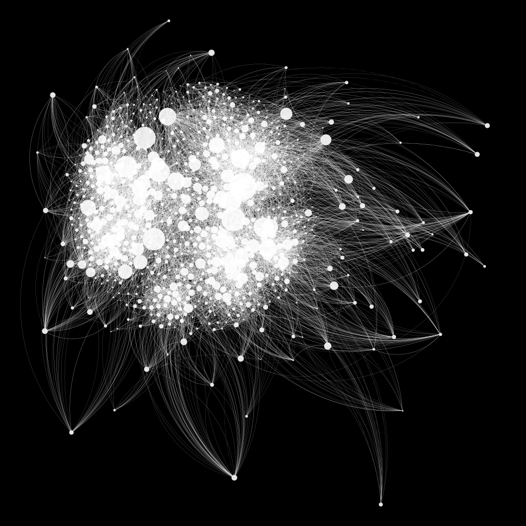
Although I eventually created similar graphics to the project I chose, I had questioned what I was doing. If I take this massive amount of random data and create a network graph without a clear purpose, the result will be difficult for anyone to understand. And they even won’t know whether the data is true or not. What are some of the roles a data visualisation graph that has lost its initial(original) purpose of communicating data can play? Engaging with populism and propaganda…? However, this is just a personal question that has arisen purely in the course of my work.
“While Euler did contribute a solution to the general cubic, appeals to authority don’t require that the authority has actually proven the result. It may not even require that the result is true. In an opinion piece in the Notices of the AMS, American mathematician Melvyn Nathanson makes the following speculation:
How do we recognize mathematical truth? If a theorem has a short complete proof, we can check it. But if the proof is deep, difficult, and already fills 100 journal pages, if no one has the time and energy to fill in the details, if a “complete” proof would be 100,000 pages long, then we rely on the judgments of the bosses in the field. In mathematics, a theorem is true, or it’s not a theorem. But even in mathematics, truth can be political.
When the authority of reference is oneself, a proof by authority becomes a proof by intimidation.” (Ording, 2019, p.24)
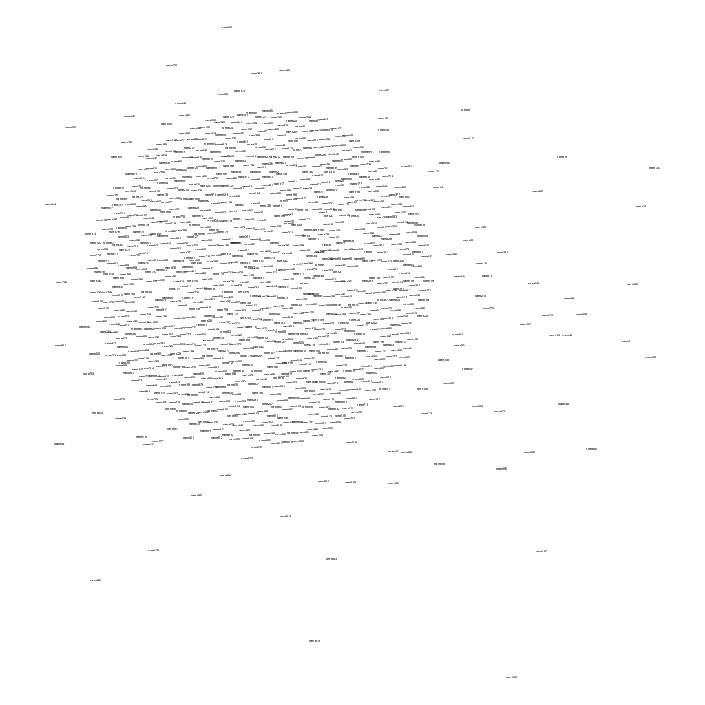
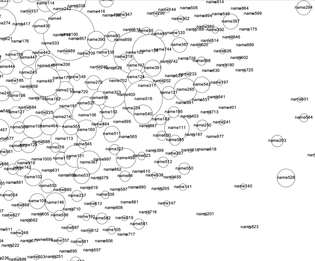
I can see the random names of the nodes with meaningless data.
At the end of the first iteration of the project, I found it graphically limited, even though ‘Gephi’ has the purpose of data visualisation. In an environment where not even the shape of the nodes can be changed, I began to consider the question “How can graphic designers convey a sense of context in a design environment where visual representation is extremely limited?”
I would like to further explore minimalist graphic design for the purpose of communicating data by experimenting with how this messy data can be organised by applying the principles of ‘minimalism’ and ‘minimal design’.
Feedback:
- This needs additional explanation to help others understand. Make a video of the software in action.
- You need to experiment more with Gephi, to explore the variability and possibilities of the software.
- Think about how you could ‘hack’ this software (how you could break in and take control of it).
- Instead of focusing on functional features of the software, try using it in a graphical way, such as creating typography or film.
Reading References
- ‘The Work of Art in the Age of Mechanical Reproduction’
- ‘Conditional Design Workbook’
Bibliography
Philip Ording, (A Few of) 99 Variations on a Proof